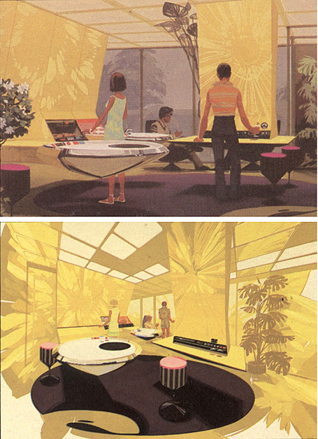
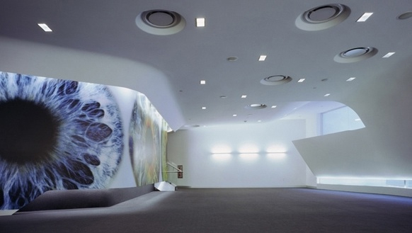
I've always been fascinated by the huge and often unacknowledged debt that architecture and science fiction owe each other. Does Neil Denari ever talk about Syd Mead?
Syd Mead, Sketch for a Suspended Kitchen, 1979
Neil Denari, Endeavor Talent Agency Screening Room, 2004
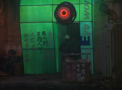
I had suspected there were more explicit connections, and maybe it was the big screen, but I didn't notice this until what was probably my 17th viewing of Blade Runner:
Syd Mead, l.a. Eyeworks, Blade Runner, 1982
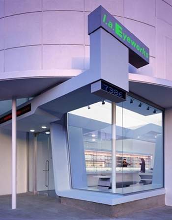
Neil Denari, l.a. Eyeworks, 2002


4 comments:
I've spent a little time with Neil in studio and I recall very few mentions of Syd Mead, among about a zillion other artists, photogs, writers, etc... And though I would agree that they may share opinions on what is cool, we should acknowledge the following:
Neil=architect dealing with space and built form(s)
Syd=futurist artist dealing with art directing and concept generation
Now that being said - your idea is very intriguing because it makes the implicit statement that what is important in cultural exchange (movies, toys, images, cars, design, art) is a pure idea expressed by an image, and not a functional object that has to be physically real.
(Also, you have to admit that the Blade Runner set version of LA Eyeworks is pretty bad compared to the real world version. It would be interesting to find out if that was a Mead design or a Paull design)
Basically, my take on your idea boils down to this: if you took Syd out of his business of making illustration and futurist consulting and you took Neil out of his business of making built form - you'd probably see some kind of agreement from both of them on what is cool, and what kind of world should be made by creative people.
In a radical way, they are both futurists.
Neil = Very cool architecture from a very cool image (making images into architecture)
Syd = Very cool movies from a very cool image (making images into more developed kinds of images)
It might also be useful here to acknowledge the fact that architects become well known for the images of their buildings well before the buildings are there. And it also seems that the more radical the image, the longer it takes to become a building. I like the idea that young architects and designers are made by images, and then tested by having the objects manifest in the world of laws and the public user....
I grabbed pieces of interviews with both guys to help illustrate my take on your idea. Mostly the quotes support the idea that these guys share a philosophy of what is cool. They're below...I put some comments in brackets like [this]...
Interview with Syd:
http://www.illusiontv.com/features/syd-mead/
Some of Syd's words from the above interview:
"Q: How important is it that your mechanical designs appear “real-world” functional?"
A: VERY. That’s the mystique that I’m known for. My formal education was in industrial design, both consumer product and transportation. I learned rotational and volumetric rationale. The trick is to create something absolutely startling (that’s the end goal) that is recognizable for what it is, and that it looks like it would actually ‘work’ within the parameters of the technological world in which it exists, even if it is only a picture. If you understand mechanical design, you can ‘overlay’ a mechanical rational onto anything you come up with and people will see it and say to themselves’ “hell, that looks like it would work that way.”
[Syd understands mechanics really well, so his stuff looks real. Architects do this and then have to subject their concept to a crazily rigorous process involving hundreds of people, laws, and ultimately the public. Illustrators and production designers have a rigorous process, but in the end, it manifests in a very temporal object and the artifact of the process that matters is exchanged and consumed culturally as an art experience. An image in a book, a picture in a gallery, a motion picture, a toy. Syd's work as an auto designer surely influenced many aspects of the final product at Ford, but maybe all the design ideas of Deckert's flying car are best when we see them in the virtualized space of a future Los Angeles, and not at a Ford booth in a auto convention.]
Interview with Neil:
http://archinect.com/features/article.php?id=64628_0_23_0_C
Some of Neil's words from the above interview (sorry, you'll have to check the link for questions, this interview is more of rambling conversation, actually...):
NEIL: "Industrial design is a big influence for me. As much as the hard core aspects of architecture, of course. It is also a big challenge to transfer technology on that scale."
[In other words, how do architects bring anthing at all from industrial design (tiny stuff and tiny physics) over to their own practice (massive stuff and bigger physics.]
NEIL: "There is a wide idea of pragmatics involved. Pragmatics don't necessarily come pre determined for the formal language."
[Here I think he is basically saying that the problems architecture has to solve don't necessarily mean having to make something look cool, smooth, futuristic, machine-like..]
[In this interview Neil is acknowledging some of the hundred's of external influences on his work (he used to work for Airbus - then called Aerospatiale). Racing cars, graphic design, cinema, photography - all of these are great influences (not the work of futurist illustrators...)]
From the same interview:
Neil: "I always wanted to pursue building. It wasn't like I came out of the cave and said I want to design buildings. Since the early 80's I was always interested in building hi-economy projects -meaning if you put in a little you get a lot, which is a modernist idea. Then develop a set of strategies that are very buildable. One of the reasons many architects were able to use the same method, because it is eminently buildable. I was very conscious about wanting to be able to realize this work. And, it is not very hard to look at it and see this hi-economy thing. There is a maximum-spatial effect although we are dealing with Cartesian systems. We are using extrusion, radii, intersection or the thickness of the surface, this stuff has been incredibly dramatic in it's 'finished' sort of input. That's why I call this hi-economy. Therefore it is not as peculiar as, lets say Frank's (Gehry) work with it's masterful interplay of a different set of proportional issues. I probably have enough conventional and organizational systems in my work that people are able to expand upon. I am just happy I get the opportunity now start building the unfolding work."
Wow, thanks Grand Moff, for such a sharp analysis of what was probably a too-hastily thrown-together blog post. Sorry I missed this before.
One of things you're saying here, if I'm reading right, is that Neil's starting from an image and then tests and develops it with other concerns. While Syd claims to be starting from other concerns, and then creates an image out of those.
It might be important to remember that Neil's and Syd's productions are both operating in very different arenas.
For the imagery that Syd's creating, the real test for success or failure is it's believability. The image must, as he says, be 'startling', but that's nothing unless it's plausible, too.
For Neil on the other hand, working in architecture, plausibility is assumed out of hand. Especially when making built work: it's like, well there it is. We take for granted that it works. The challenge for Neil, and for architects that want to advance a cultural conversation in general, is to create something that works, and also brings in more things to the table: more resonance, more information, more disciplines, more everything ... it's the only way to make something that's really new, but has the kind of emotional/intellectual impact that comes from rigorous development.
This impact is something else that's shared in the work of both these guys. And one of the things I wanted to imply here, is that it's almost like the image itself draws the rationalizations and methods into being. Both these guys are coming from different directions, to arrive at a similar place, but sometimes I think the place was always there, and that emotional/intellectual impact is what draws designers to it, like bees to a flower. And the method is just like the little dance they do when they get back to the hive.
Hot sale Cheap cell phonesand cell phone china on our site! Fashion look and powerful functions for these mobile phones even discount cell phones! Wholesale HiPhone, 3G cell phones, PDA/Smart Phone now.China Cell PhonesDon't miss these cellphone!toysDiscount Handbags On Sale-Beautycasa Online :
Ever so often you may possibly aspire just before aid by hand accomplish a certitude at the same time as headed for which the best software to advantage. The best video editing software
Post a Comment